Dō Good is a vegan cookie dough brand that produces pre-mixed and pre-cut cookie dough portions, similar to Nestle's pre-cut cookie packages.
The creative brief for this project required that the branding be representative of an art movement in history. Dō Good's style resembles that of the Bauhaus art movement -- consisting of geometric shapes, angular type, and essence of primary colors.
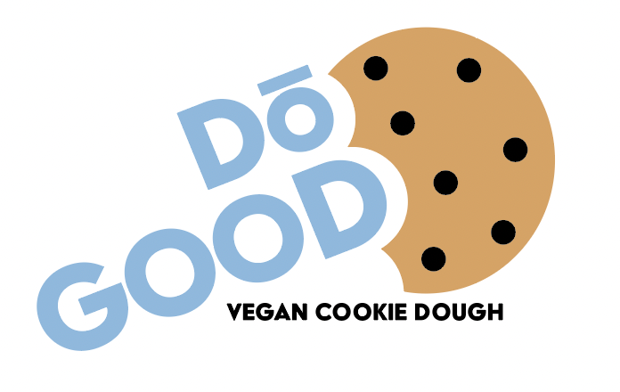
Dō Good is pronounced as "Dough Good" hinting that the cookies are SO GOOD.
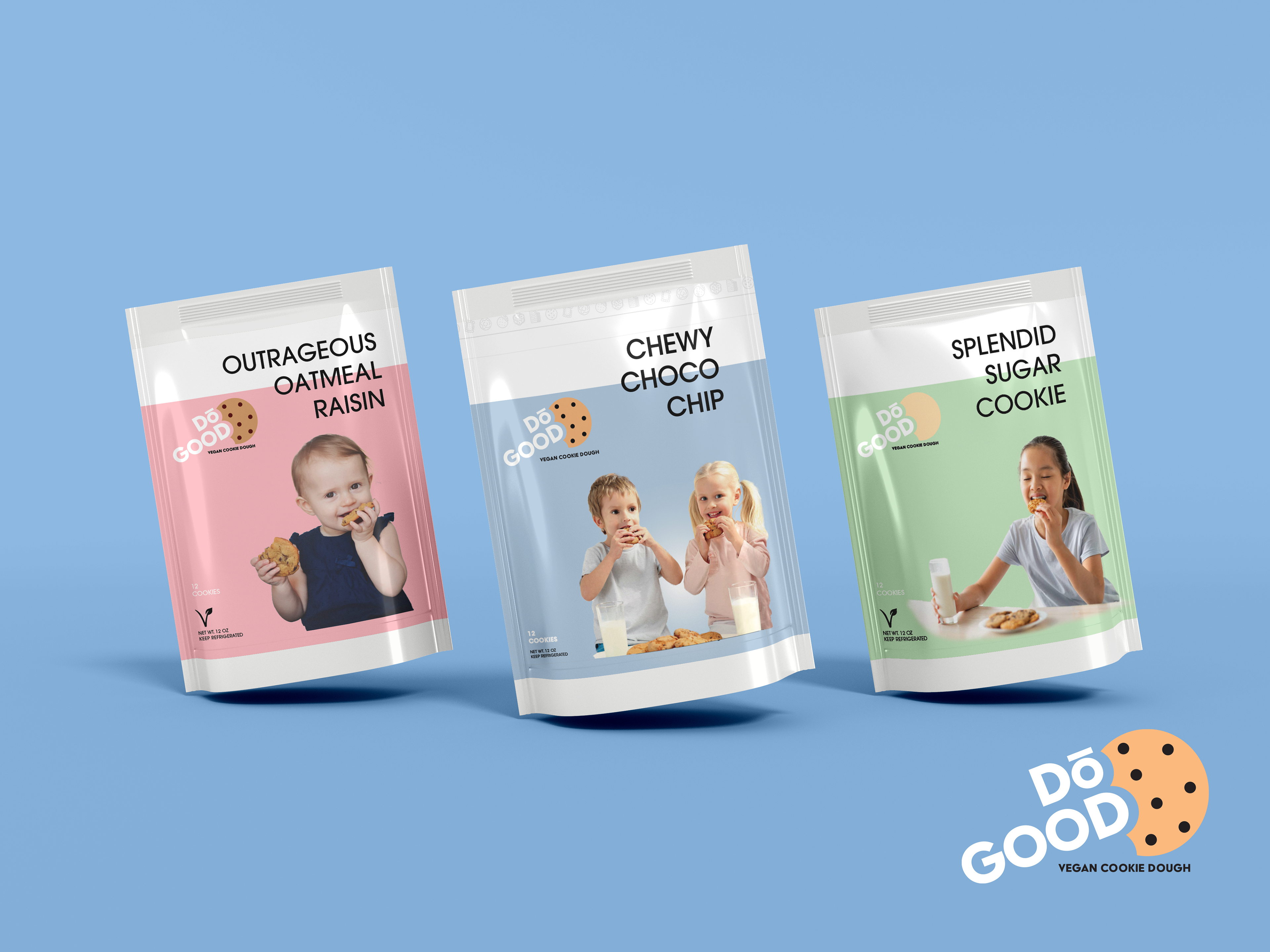
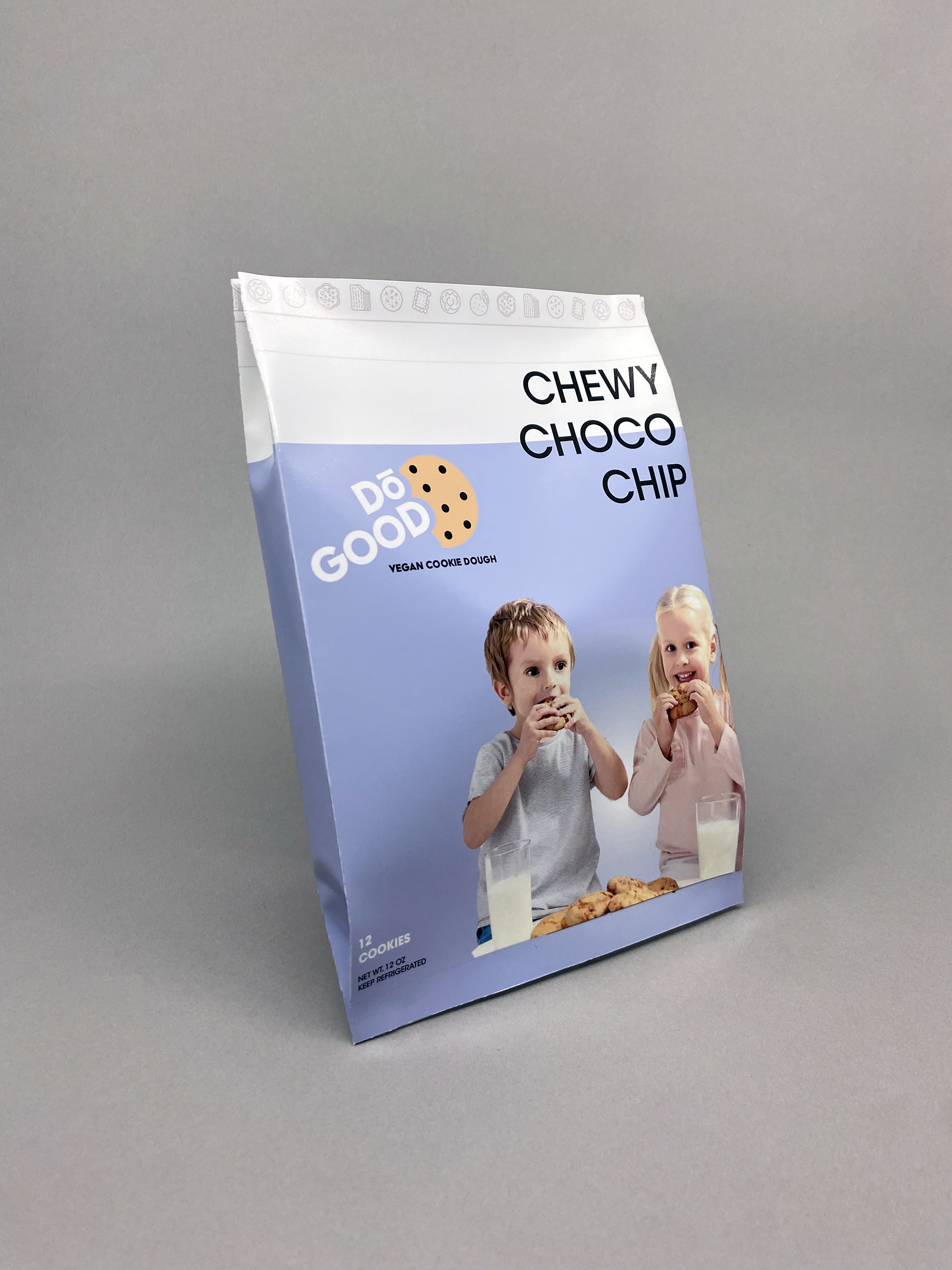
Each package represents a different variation of the cookie dough and how the logo would alter as such.
I chose to include children on the front of the packages to draw the attention of younger kids as they are being dragged around the supermarket. The goal is for the packaging to feel relatable for children, thus making them beg mom or dad to buy the cookie dough. Of course, Dō Good cookie dough is not only for children, though :)
What's more relatable than a kid enjoying a warm cookie?
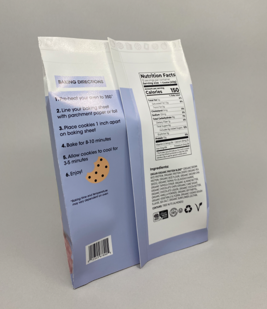
I also got the chance to create a mock package for Dō Good cookies to give a better idea of what the final product would look like on the shelves.
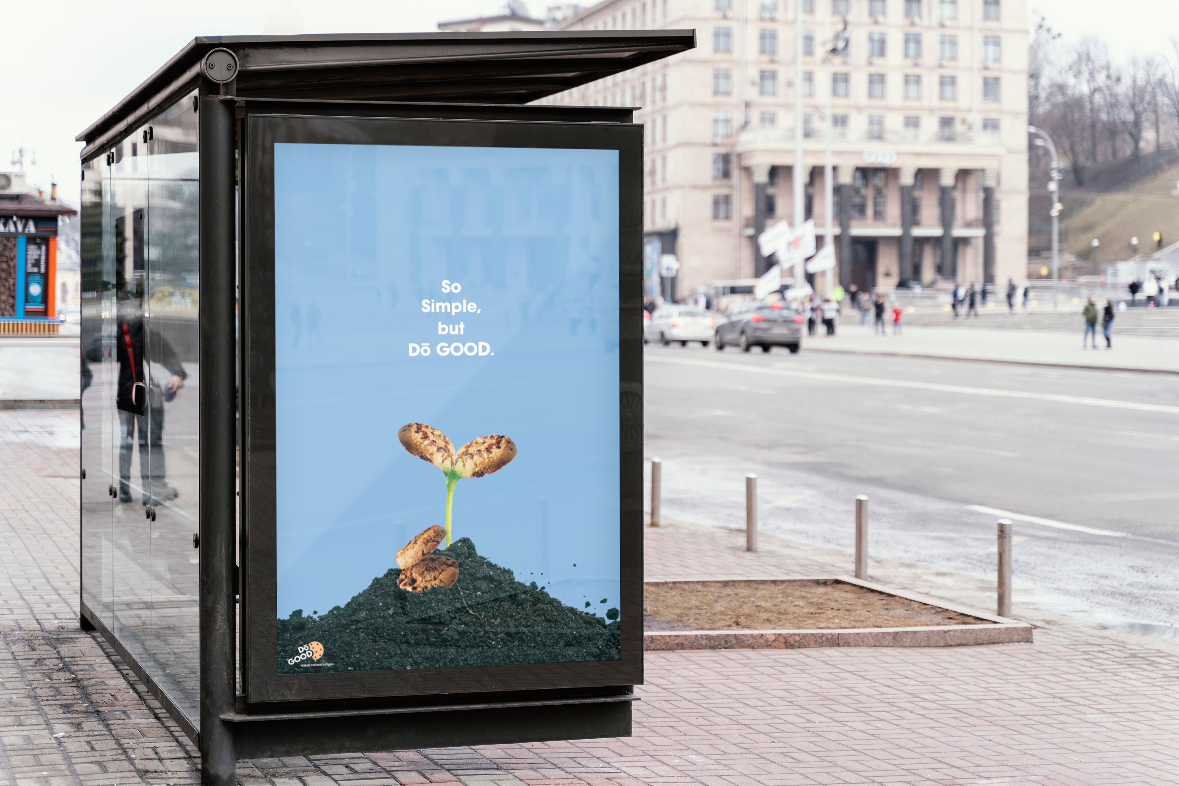
In congruency with the cookie dough's packaging, I created an advertisement that you may see while waiting for the bus, or scrolling on social media. Again, tying in with the pronunciation of Dō, the advertisement features a play on words.
To depict the vegan ingredients, I chose to portray an unlikely cookie sprouting from the ground as if it were a plant, emphasizing the natural composition.